Wednesday 25th June.
I went to meet Ben Simpson with Vicky, Andy and Dave to show him our work and talk about plans for the summer and maybe to help him with some work. We went to his studio which was lovely and had some tea. I had tea with milk but no sugar, Andy had milk and 2 sugars, Dave had no milk or sugar and Vicky had no tea because she doesn't like the sensation of hot drinks. We talked about our work and what were interested in. As it happened I don't think it was very suited to me as I haven't really done anything character based and I don't really have a great interest in comics. However I told him when i was available in case he needs someone who can't draw very well. It worked out for the best because he rang Vicky and Andy back to do a work placement and they didn't have one until then so yey :)
Wednesday, 25 June 2008

Thursday, 5 June 2008
PPD EVALUATION
 Mozilla Firefox Start Page
PPD Evaluation
Throughout the second year I feel I have progressed a lot - in my approach to answering briefs, the quality of my work and my confidence. Confidence was the main thing I wanted to improve at the end of the first year and I realise now that it was hindering my progress as I thought I wasn't good enough.
I think I have learnt a vast amount of skills this year including the software we have been taught like Flash, After Effects, DVD Studio and DreamWeaver, as well as improving my existing knowledge of software like Photoshop and Illustrator, which I have used for most briefs through the year. I enjoyed working with animation as it is something I have always been interested and I attended Pictoplasma animation festival which I really enjoyed but although I love to watch it, the annoyance of producing it has put me off wanting to go into that area quite a lot and I think I would prefer to work with print based graphics more than digital.
Also, through the print module, I gained some knowledge of the print process and colour management. This has been very useful to me so I can use this knowledge in my other work to make sure the end print is as best as it can be. It has also been helpful for the CD project I did for a small band (on blog).
I chose image rather than type for the optional module but I don't know if this was the right decision because by the end of the module I wasn't enjoying it and I think it is more useful to know about type and I don't think I want to be an illustrator as I rarely chose to draw for my studio work (even though it is what I like to look at from professional designers.) Through the visual language module I became interested in digital collage and used it for several of my CD covers. In particular I looked at the work of Julien Pacaud


who does a lot of editorial work as well as for music. I think this came from feeling I wasn't very good at drawing so I tried to make images in different ways. Also, I have looked at illustrators who use plain black and white drawings such as David Shrigley
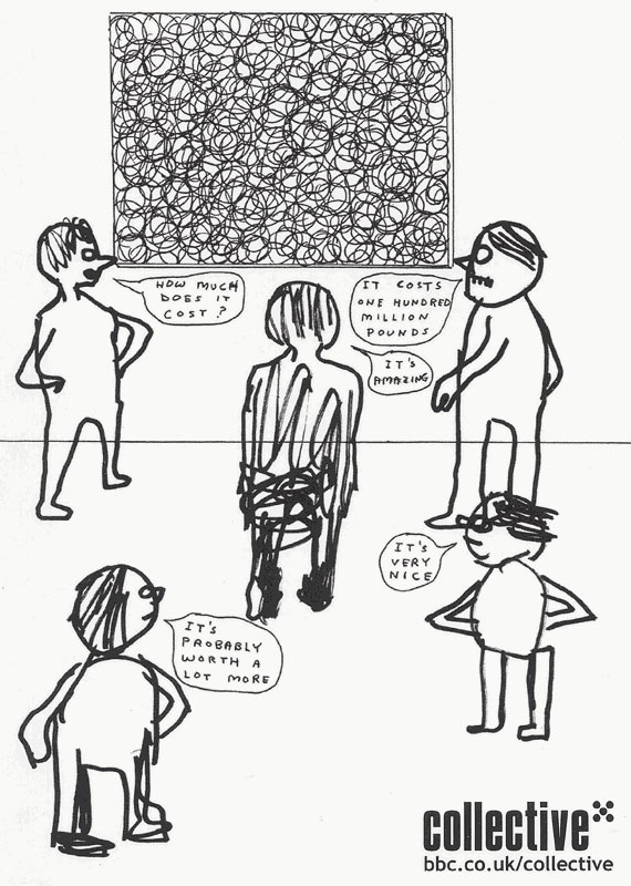

and Edward Monkton whose work is more based on ideas than a good looking end product. This helped me in the Dig for Sanity brief where I learnt not to try to draw well if the idea was good and this is what I like about this type of illustration because I am more interested in concepts surrounding work than making things look perfect. I think my main strength is ideas and this is evident in most of my work, in particular, the postcards I did for Postcards2Print, for which I used straplines to inform about issues surrounding Tesco. I also think I am a fast learner and I have picked up a lot of skills this year and continue to teach myself stuff at home. I can tell that I am progressing because every project I do is a little bit better than the one before in some way.
The things I need to improve are the presentation of my work as it looks scruffy sometimes. This is something I am trying to look at with designed identity as I have took quite a lot of care over the final outcomes.
This year I have learnt that I work well under pressure and I have learnt that I can control how stressed I am with good time management and I have found it useful to do weekly plans of my time to the hour. This has been especially apparent in the last couple of months with the 203 briefs, designed identity and visual language all running at the same time.
I have found that I can come up with ideas quite quickly and I am much better at making decisions than last year. This has helped with the 203 briefs where I have had to work quickly, but I perhaps don't try out enough ideas before deciding.
I don’t know what my focus is as a designer and I hope I will know in the third year, although in my opinion it is not that important and I would rather not limit myself to one thing then realise I don’t like it further down the line. I like image, print and I like playing with ideas so these are things I will do more of next year.
My work placement for two weeks in the Summer is Calvert and Pyrah (www.calvertpyrah.co.uk) in Elvington near York. I hope my time there will help me to clarify what in particular I would like to do. They appeal to me because they do print based promotional work for small and ethical clients like museums, schools and organisations and I think that is lovely.
Overall I think my second year has been successful as I feel loads better than at the end of the first year in terms of where my work is at, but it has also been confusing as I still like everything and I keep being told to specialise.
Tuesday, 27 May 2008
FADO ROCK CD


I have just finished doing the artwork for a band in Hull's new CD. It came in handy to know a bit about the printing process from the design for print module at the beginning of the year. however i still didnt understand a lot of the stuff i had to do. once i had been given the templates for the artwork it got really hard and technical so i might try and get a day or two work experience at a printers this summer to see if i can be taught some more stuff about printing.
Friday, 9 May 2008
CV


I recently typed up my CV but instead of using a computer I decided to use a typewriter to make it look old and not perfect and so every letter was different in the weight of ink. I couldn't get hold of a really old one but used an electric one which still came out good. I plan to round off the corners to make it look like a playing card like this!
Tuesday, 1 April 2008
Hotel Chocolat design


I got an easter egg from hotel chocolat and i think the packaging was just as tasty. The black box was subtly embossed with a floral pattern and the scarlet red sleeve is around the box. This contained a sheet of lovely, slightly corrugated paper with a keyhole shape cut out of it. At £20 an egg the packaging needs to be this classy. If there's one criticism it would be that they are obviously not concerned with environmental issues as there was a lot of unnecessary packaging.
D&AD


We submitted our D&AD before easter and im really pleased with what we did. it was the first time id worked collaboratively and i think we worked really well together. The brief asked for a fresh new look for sanitary products. Our chosen concept was environments and we came up with the brand identity of 'time' which was then prefixed by 'one', 'some, and 'every' to indicate how many of the product is in the box. For example 'one...time' has only 3 in and could be handy for a night out. We decided on bold colours in the end as we hoped the confidence of the packaging would affect the customer in a confident way too. The information is printed on the inside of the box to save paper.
Tuesday, 15 January 2008
DVD Research for Interface Brief
Im looking at mostly British horror DVDs but also some non-British ones for my research into DVD interfaces.
Nightwatch
The opening sequence shows moving blood vessels flying passed you as if your going through the body. Its really flashy with the colours changing to red then black and white. On the menu a splattery shape indicates what option you are on and changes colour when you press play. This makes it clear to see where you are and what your selecting. Nothing moves on the different menu screens and there is no transitional sequence which makes it quite boring. The writing is blurry and yellow on red which is hard to read. What is amazing about this film is the subtitles which interact with the movie. The words appear in loads of different ways like fading, flashing and even turning into blood. It would be interesting to see this done on the menu of a DVD.
Severance
For the opening sequence the head of an office guy falls off and blood spurts out. This dark humour goes with the mood of the film. Then it goes to the menu screen and every so often splatters of blood fall out the body which is swaying. The sound is like wind blowing and squelches as blood comes out. I like the way the screen slides to the side when you select something. The scene selections menu shows clips from the chapters in polaroid photographs which are hanging from swaying meat hooks. Here there is the sound of blades being sharpened. A blood splatter is the shape which moves to select a chapter. There is a simple white background throughout.
The Descent
Spooky cave wall for menu background with a spotlight hovering over the different options. The noises are of running water, screeches from the monsters, rocks moving beneath feet and echoey drips. You can't get anywhere without waiting for the torch light to go over that option then you have to quickly press before it goes onto something else and this is quite annoying. When you choose something you spinny round to a different cave wall in a fast swooshy motion. Drips of water fall down in some of the menus.
From Hell
Spooky echoey noises. Low opacity photo in the background of a street. Misty. Italic font to symbolise 1888. Everything is to do with anatomy and every page has got a different diagram of a body part. the text on the menus is all staggered and not on a baseline.

Slither
Alien slug slithers across screen to reveal the title. American typewriter style font is used which is slightly blurry and white. There are squelchy sounds with plinky plonky music. In the transitional sequence skin splits to reveal the chapter selections which are on a gross fleshy background. The screen has got black edges as if there is a spot light on it. Special features menu is a tree and every so often a slug crawls out. An out of focus family garden is in the background with kids laughing.
28 Days Later
Numbers count upwards on a black and red background til it reaches 28. On the menu there is the sound of wind and the scene is a deserted london street. Every so often a split second flash of the movie will appear. The only things that move are smoke going across and a newspaper blowing in the wind. The film's logo (similar to a toxic symbol) indicates what option you are on. There are no transitional sequences between menus.
Creep
Scene of inside an underground train. The picture is jolting around. A hand comes up very suddenly and slides down the screen leaving behind a blood stain. Cursor for selection is a blood splatter and there are train noises and screams. Text is written around the title. Transitional sequence - the lights go out on the train one by one until its black then the next menu comes up. This DVD one was easy to use with clear type. it uses different type sizes for different words which looks interesting. One menu features a wall with an eerie shadow on it.
Dog soldiersThe opening sequence happens too quick and there are too many things going on .The title is ripped with claws to reveal menu. Picking an option makes gun shots be fired through the background so the next menu can be seen. The different options are all over the place and not great for userbility because you don't know which direction to press on your remote.

American werewolf in london
Not a British film but set in London, the menu shows London bridge, the sky is misty and the moon rises up into the sky. The song 'Bad moon rising' by CCR makes it ironic, quirky and not cheesy, which I think is what makes British horrors so good.
Nightwatch
The opening sequence shows moving blood vessels flying passed you as if your going through the body. Its really flashy with the colours changing to red then black and white. On the menu a splattery shape indicates what option you are on and changes colour when you press play. This makes it clear to see where you are and what your selecting. Nothing moves on the different menu screens and there is no transitional sequence which makes it quite boring. The writing is blurry and yellow on red which is hard to read. What is amazing about this film is the subtitles which interact with the movie. The words appear in loads of different ways like fading, flashing and even turning into blood. It would be interesting to see this done on the menu of a DVD.
Severance
For the opening sequence the head of an office guy falls off and blood spurts out. This dark humour goes with the mood of the film. Then it goes to the menu screen and every so often splatters of blood fall out the body which is swaying. The sound is like wind blowing and squelches as blood comes out. I like the way the screen slides to the side when you select something. The scene selections menu shows clips from the chapters in polaroid photographs which are hanging from swaying meat hooks. Here there is the sound of blades being sharpened. A blood splatter is the shape which moves to select a chapter. There is a simple white background throughout.
The Descent
Spooky cave wall for menu background with a spotlight hovering over the different options. The noises are of running water, screeches from the monsters, rocks moving beneath feet and echoey drips. You can't get anywhere without waiting for the torch light to go over that option then you have to quickly press before it goes onto something else and this is quite annoying. When you choose something you spinny round to a different cave wall in a fast swooshy motion. Drips of water fall down in some of the menus.
From Hell
Spooky echoey noises. Low opacity photo in the background of a street. Misty. Italic font to symbolise 1888. Everything is to do with anatomy and every page has got a different diagram of a body part. the text on the menus is all staggered and not on a baseline.

Slither
Alien slug slithers across screen to reveal the title. American typewriter style font is used which is slightly blurry and white. There are squelchy sounds with plinky plonky music. In the transitional sequence skin splits to reveal the chapter selections which are on a gross fleshy background. The screen has got black edges as if there is a spot light on it. Special features menu is a tree and every so often a slug crawls out. An out of focus family garden is in the background with kids laughing.
28 Days Later
Numbers count upwards on a black and red background til it reaches 28. On the menu there is the sound of wind and the scene is a deserted london street. Every so often a split second flash of the movie will appear. The only things that move are smoke going across and a newspaper blowing in the wind. The film's logo (similar to a toxic symbol) indicates what option you are on. There are no transitional sequences between menus.
Creep
Scene of inside an underground train. The picture is jolting around. A hand comes up very suddenly and slides down the screen leaving behind a blood stain. Cursor for selection is a blood splatter and there are train noises and screams. Text is written around the title. Transitional sequence - the lights go out on the train one by one until its black then the next menu comes up. This DVD one was easy to use with clear type. it uses different type sizes for different words which looks interesting. One menu features a wall with an eerie shadow on it.
Dog soldiersThe opening sequence happens too quick and there are too many things going on .The title is ripped with claws to reveal menu. Picking an option makes gun shots be fired through the background so the next menu can be seen. The different options are all over the place and not great for userbility because you don't know which direction to press on your remote.

American werewolf in london
Not a British film but set in London, the menu shows London bridge, the sky is misty and the moon rises up into the sky. The song 'Bad moon rising' by CCR makes it ironic, quirky and not cheesy, which I think is what makes British horrors so good.
Subscribe to:
Posts (Atom)
