Friday, 14 November 2008

Animations


On Wednesday I went to Hyde Park picture house to watch a reel of short animated films which were part of Leeds Film Festival. I mostly went because Vicky told me that Nick Park had an animation in it. It turned out it was just an Aardman film but that was cool cos they tend to be weirder without Nick Park. My favourite one was about a man who was hit by a meteor and the consequence was he had to live 91 cm from himself. It was called "Skhizen" by Jeremy Clapin. It was very funny but sad too and it had French narration which i'm always a sucker for

Monday, 6 October 2008

don't panic entry


Last wednesday I got feedback on my don't panic posters. I did 2 very different ones and was torn between them.
On the feedback sheets 2 people had said that the black one is better and 1 person said the slot machine on was better. I thought the idea was clearer on the black one but the slot machine one was more fun to look at. I tried to improve them both from what was said which was:

On the black one - make the background lighter
- change the font

On the slot machine one - Change the layout
- Make it more of a cycle to show my intended message that slot machines are addictive and they dont pay off
- Add a caption


These are the improved ones. I am entering the MACHINE one because I think its simpler clearer and has more impact than the slot machine one.


Wednesday, 10 September 2008

museum/exhibition grahics

After doing work experience at a company where they do lots of work for exhibits for museums and attractions, I have been looking at other companies/designers who do graphic design for these types of spaces. It appeals to me because I like the use of different media that is used and the varying scales that work is produced in, from walls to information cards.

Helmo
Helmo is a French studio founded by Thomas Couderc and Clement Vauchez. Couderc says the most important thing is to feel what sort of a role graphic design should play in an exhibition 'sometimes it can be strong, visible, graphically particular, to give a particular identity to the exhibition; at other times something almost invisible.'
This is an exhibition called ROCK'N'ROLL 53-59 which documented the history of rock n roll through this time period. Helmo did the Graphics for it and used large scale black and white photography with bold coloured information cards to surround the newspaper clippngs, records and images in the exhibition.


Small
Small was formed by David Hitner and Guy Marshall and they do art direction and design for identity, literature, packaging and exhibition work. They believe that listening to the client should be the studios first priority and that when designing for exhibitions, 'understanding the subject matter and creating pace and drama with the images and information' is key. My favourite work I have seen of theirs is for Heineken Greenspace. This was a promotional project which saw desolate and derelict warehouses and spaces in Valencia, Spain, rejuvenated by inviting artists to come and make them into vibrant art spaces which would then be the venue for a opening show featuring bands and new muscial talent. Small were asked to design an identity and visual language for the project. They designed a font which was then used for the logo and a visual language for the whole thing was then created, collaborating with an architect, a photographer, and a graffiti artist.


Genevieve Gauckler
This French artist built an exhibition around the subject of the food chain using a design style that is very light hearted and colourful. It involves simple, rounded characters to illustrate information and stories about the food chain and how and why things consume the way they do. Influenced by Western society and consumption as a theme, Genevieve raised issues such as bulimia, obesity and vegetarianism but within the fun world of these vivid characters. She said the reason for using the characters is that she is constantly coming up with them and challenging herself to create them and this exhibition gave her an opportunity to show them.


These violent veg style food characters were created for an animation shown in the exhibition.

Friday, 1 August 2008

Work Experience

I have just finished doing two work placements back to back - the first was two weeks at Calvert&Pyrah, a company at Elvington airfield, then the second one was a week and a 1/2 working for my sister's bosses at their house in France.
They were very different in lot of ways.
I really enjoyed working at C&P I learnt a lot to do with software skills, designing for print and my confidence was boosted through the work I produced. I did a corporate identity for a marketing company, i was surprised that they trusted me to do this and i was really scared but in the end but I was very pleased with the results and Im glad they asked me to do it rather than making tea or something. heres some examples of ideas that i sent to the client and the final stationary set at the end. it was exciting to get my work printed :-)


I also helped them with some really cool work that they do with a company called Paragon who they are joined onto (www.paragoncreativeltd.co.uk) who do theming, models, figures, fit-outs and interactives for museums, tourist attractions and anywhere like that. I helped them do a few things for Ripleys Believe It Or Not London which will be opening soon.
It was really enjoyable especially because of this unusual work they get to do. It helped me realise that i want to work in a company rather than freelance because in the second work place i felt alone and didn't have anyone to ask for advice. Also it helped me to confirm that I want to do design for print as i enjoyed all of that work but when i was asked to do templates for websites i didn't really enjoy it. I helped them to update Paragons website by doing new templates on Photoshop and even though it wasn't anything to do with building or programming the website just because i knew it was for the web i couldn't do it very well.


I also helped the owners of the company with some ideas for a logo for their t shirt company which is a side project from their business.


In France i did a brochure, posters and identity for a company who train graduates and executives. it was a very boring subject matter so I didn't feel like i could do much with it. Also the boss had no communication skills, I wasnt given a proper brief and the boss went back to the UK after a few days so I had to guess what they wanted. I even had to rewrite some copy of the brochure because it was so appalling. Some of the best work I did got brutally rejected and the worst stuff they seemed to like so it made me realise that I wont get a say in what work goes through in the real world. Im glad I did it though because it will look good on my CV and I have to get used to being treated badly because it will probably happen again when I get a job.


Wednesday, 25 June 2008

A little meeting with tea

Wednesday 25th June.
I went to meet Ben Simpson with Vicky, Andy and Dave to show him our work and talk about plans for the summer and maybe to help him with some work. We went to his studio which was lovely and had some tea. I had tea with milk but no sugar, Andy had milk and 2 sugars, Dave had no milk or sugar and Vicky had no tea because she doesn't like the sensation of hot drinks. We talked about our work and what were interested in. As it happened I don't think it was very suited to me as I haven't really done anything character based and I don't really have a great interest in comics. However I told him when i was available in case he needs someone who can't draw very well. It worked out for the best because he rang Vicky and Andy back to do a work placement and they didn't have one until then so yey :)

Thursday, 5 June 2008

PPD EVALUATION

Mozilla Firefox Start Page

PPD Evaluation

  Throughout the second year I feel I have progressed a lot - in my approach to answering briefs, the quality of my work and my confidence. Confidence was the main thing I wanted to improve at the end of the first year and I realise now that it was hindering my progress as I thought I wasn't good enough.
  I think I have learnt a vast amount of skills this year including the software we have been taught like Flash, After Effects, DVD Studio and DreamWeaver, as well as improving my existing knowledge of software like Photoshop and Illustrator, which I have used for most briefs through the year. I enjoyed working with animation as it is something I have always been interested and I attended Pictoplasma animation festival which I really enjoyed but although I love to watch it, the annoyance of producing it has put me off wanting to go into that area quite a lot and I think I would prefer to work with print based graphics more than digital.
  Also, through the print module, I gained some knowledge of the print process and colour management. This has been very useful to me so I can use this knowledge in my other work to make sure the end print is as best as it can be. It has also been helpful for the CD project I did for a small band (on blog).
  I chose image rather than type for the optional module but I don't know if this was the right decision because by the end of the module I wasn't enjoying it and I think it is more useful to know about type and I don't think I want to be an illustrator as I rarely chose to draw for my studio work (even though it is what I like to look at from professional designers.) Through the visual language module I became interested in digital collage and used it for several of my CD covers. In particular I looked at the work of Julien Pacaud

who does a lot of editorial work as well as for music. I think this came from feeling I wasn't very good at drawing so I tried to make images in different ways. Also, I have looked at illustrators who use plain black and white drawings such as David Shrigley         


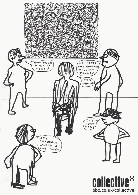
and Edward Monkton whose work is more based on ideas than a good looking end product. This helped me in the Dig for Sanity brief where I learnt not to try to draw well if the idea was good and this is what I like about this type of illustration because I am more interested in concepts surrounding work than making things look perfect. I think my main strength is ideas and this is evident in most of my work, in particular, the postcards I did for Postcards2Print, for which I used straplines to inform about issues surrounding Tesco. I also think I am a fast learner and I have picked up a lot of skills this year and continue to teach myself stuff at home. I can tell that I am progressing because every project I do is a little bit better than the one before in some way.  
  The things I need to improve are the presentation of my work as it looks scruffy sometimes. This is something I am trying to look at with designed identity as I have took quite a lot of care over the final outcomes.  
  This year I have learnt that I work well under pressure and I have learnt that I can control how stressed I am with good time management and I have found it useful to do weekly plans of my time to the hour. This has been especially apparent in the last couple of months with the 203 briefs, designed identity and visual language all running at the same time.
  I have found that I can come up with ideas quite quickly and I am much better at making decisions than last year. This has helped with the 203 briefs where I have had to work quickly, but I perhaps don't try out enough ideas before deciding.
  I don’t know what my focus is as a designer and I hope I will know in the third year, although in my opinion it is not that important and I would rather not limit myself to one thing then realise I don’t like it further down the line. I like image, print and I like playing with ideas so these are things I will do more of next year.
  My work placement for two weeks in the Summer is Calvert and Pyrah (www.calvertpyrah.co.uk) in Elvington near York. I hope my time there will help me to clarify what in particular I would like to do. They appeal to me because they do print based promotional work for small and ethical clients like museums, schools and organisations and I think that is lovely.
  Overall I think my second year has been successful as I feel loads better than at the end of the first year in terms of where my work is at, but it has also been confusing as I still like everything and I keep being told to specialise.

Tuesday, 27 May 2008

FADO ROCK CD


I have just finished doing the artwork for a band in Hull's new CD. It came in handy to know a bit about the printing process from the design for print module at the beginning of the year. however i still didnt understand a lot of the stuff i had to do. once i had been given the templates for the artwork it got really hard and technical so i might try and get a day or two work experience at a printers this summer to see if i can be taught some more stuff about printing.

Friday, 9 May 2008

CV


I recently typed up my CV but instead of using a computer I decided to use a typewriter to make it look old and not perfect and so every letter was different in the weight of ink. I couldn't get hold of a really old one but used an electric one which still came out good. I plan to round off the corners to make it look like a playing card like this!